I joined the “Love ALL Project” in early February, when the project began.
The Love ALL Project was founded as a response to a hateful act.
From Love ALL Project founder, Sharon Baanante:
“On February 6, 2017, white supremacist fliers were circulated throughout Norwalk, CT and a few surrounding towns in Connecticut. Covered in plastic sheets and filled with small pebbles to weigh them down, these were left in driveways and mailboxes. The fliers stated ‘We must secure the existence of our race and future for white children. Make America White Again’.”
“Just two days after reading about the hate fliers, I started a community movement in Norwalk called ‘Love ALL Project.’ Love ALL Project is a non-partisan volunteer organization whose mission is to support diversity and unite our community by fostering understanding and relationships between different cultures through inspiring sustainable collaborations.”
“Love ALL Project will provide ways for our community to link arms and work together to better support and understand one another. With the right resources and support, we can spread the love by sharing our community model with other towns and cities.”
I was immediately drawn to this project, and RSVP’d for the first meeting. I had been craving the goodness of something like this. I really didn’t know what I would do, but I was super eager to help. At the first meeting, Sharon outlined the needs and goals for Love ALL Project. One of the immediate needs was… a logo(!). Well, that was something I COULD do! So I jumped right in began my design process.
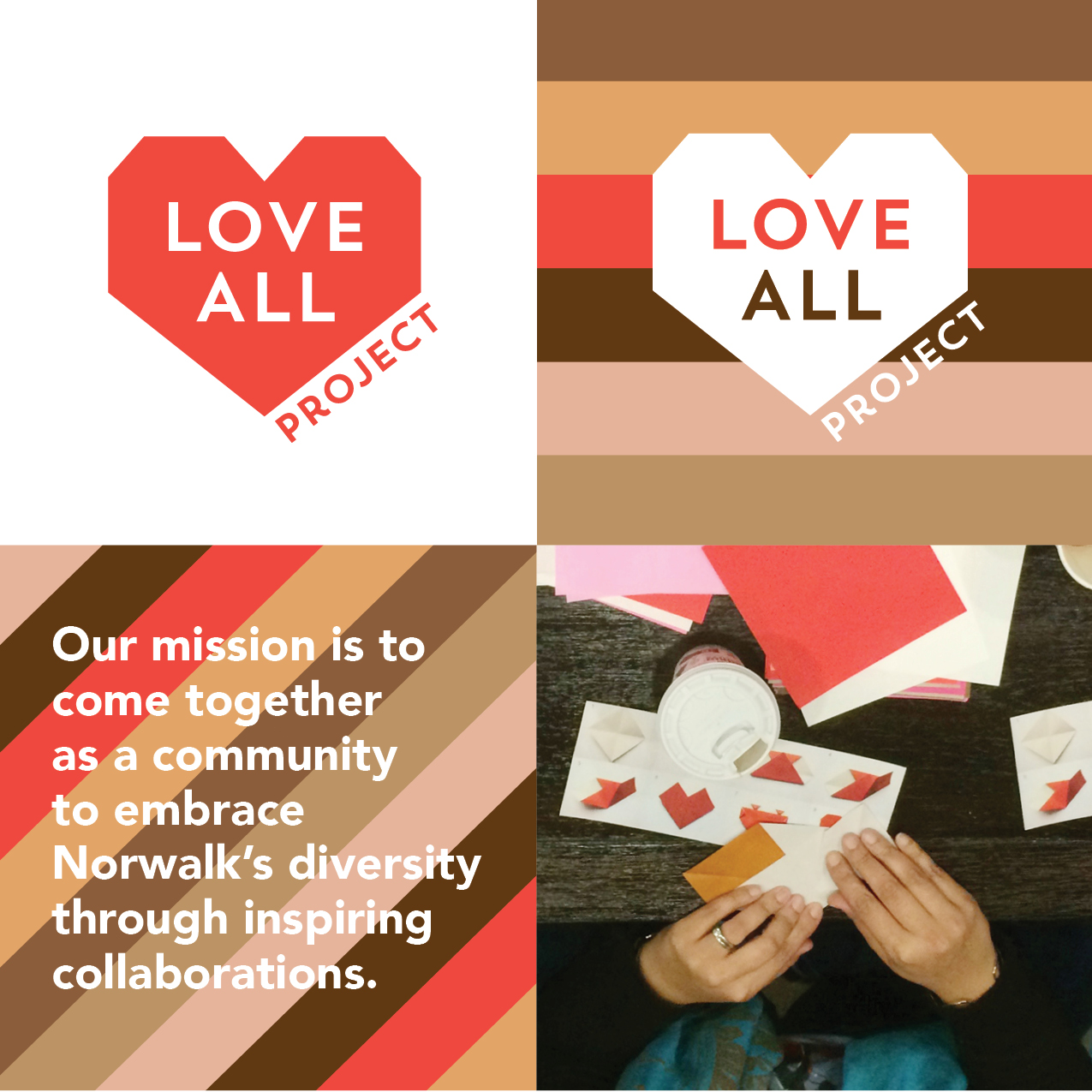
Regarding the name, I thought the word “Project” was equally as important as “Love ALL”. “Project” means “Progress” — Every small action can make a difference. Through my sketching & incubating, the idea of origami came into play. With just a square piece of paper — anyone, anywhere could make a paper heart to show their support. I envisioned people of all ages, congregating around tables, making hearts in support of the movement.
The logo shape mimicks a completed orgami heart. The squared edges also give it a badge-like appearance. When the heart is used in a repeat pattern — it represents strength in numbers.
The typography is confident and clean, and works with the shape of the heart. The color palette is made up red (awareness) and warm browns/beiges which represent the beautiful skin tones that make up our community. The stripes combined with heart shape provide versatility for many brand applications.
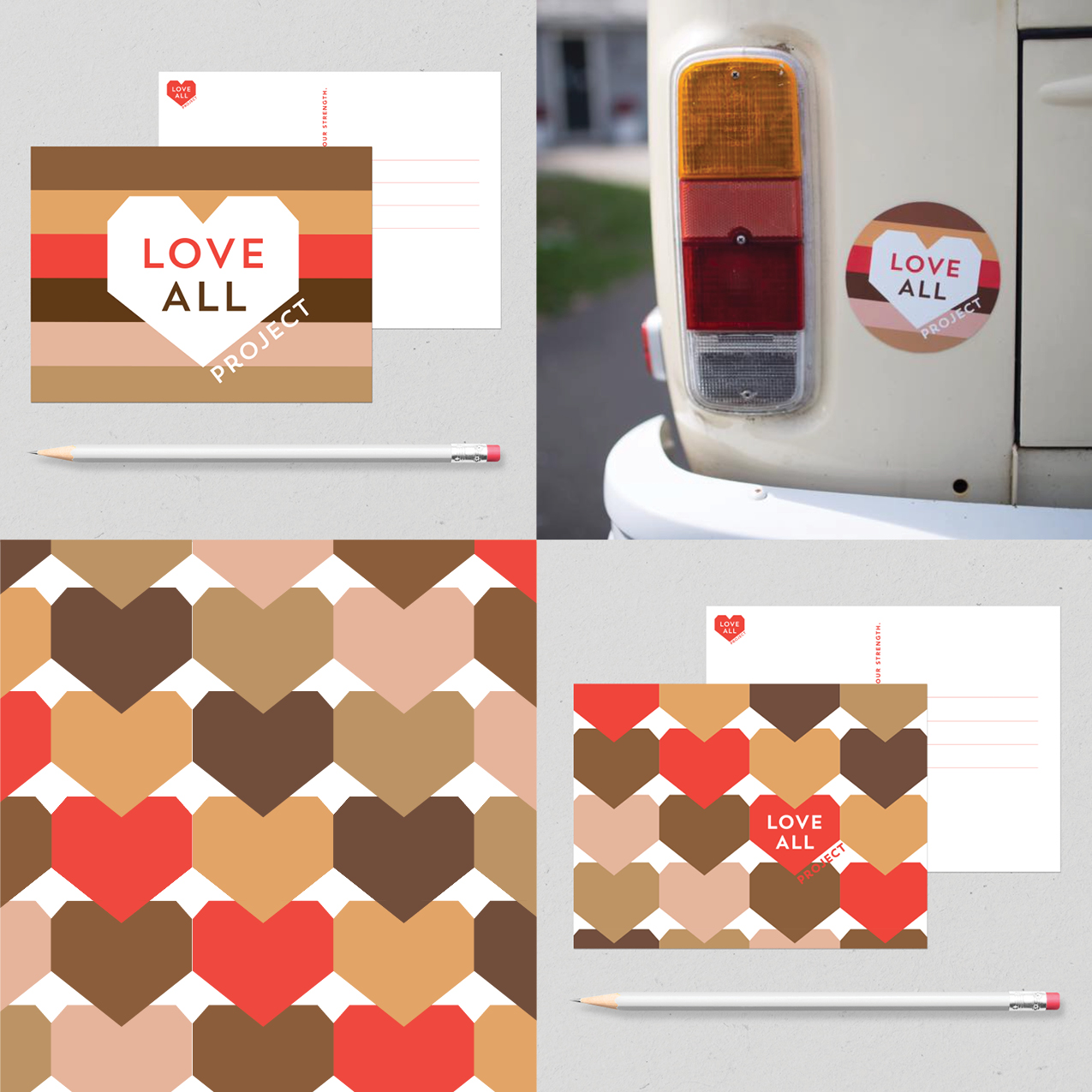
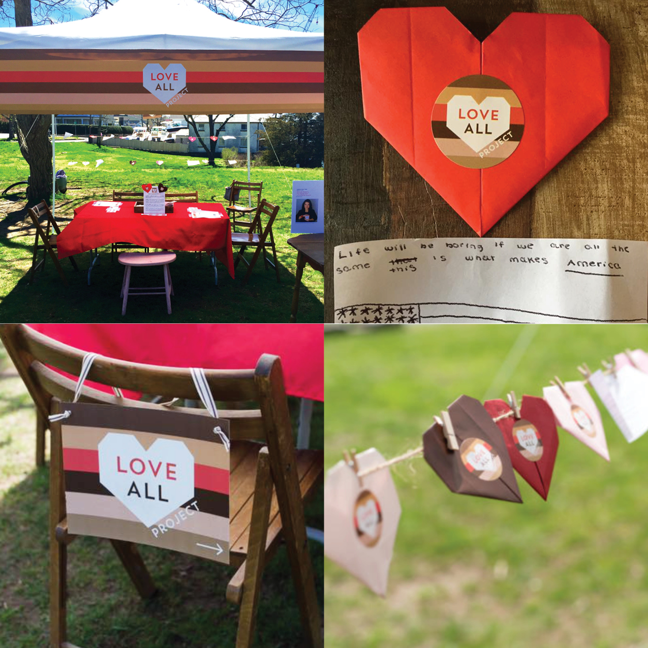
Its been only a couple of months since the project started and the Love ALL Project is growing… Meetings have been held to brainstorm on event topics — Car magnets were produced and distributed. In April, we hosted a booth at the “Growing Unity” event in Pikney Park. Local Mosques and churches are getting involved. Money is being raised to help fund this project. We are getting ready to distribute “business kits” to local Norwalk business to help promote/support this movement. We are going to develop a program for schools. We co-hosted a family event at the Norwalk Public Library on June 20th. Progress is happening.
My best work is done for companies and causes that inspire me. Love ALL Project has inspired me from day one. It’s been fun, enlightening and I’ve made some new friends along the way.
Let love rule!
#LoveALLProject #unitedagainsthate #designforgood
Select photos courtesy of Lauren Henry Photography (Thank you!)
SaveSave
SaveSaveSaveSave
SaveSave
SaveSaveSaveSaveSaveSaveSaveSave
SaveSave
SaveSave
SaveSaveSaveSave
SaveSave
SaveSave
SaveSave
SaveSave
SaveSave