A bit about “Wit” in design.
Wit allows you to infuse a deeper level of brand personality into your packaging, collateral, or any touchpoint. It can give your customers a subtle *pang* of delight.
Finding small surprises can make your customers chuckle. And perhaps they’ll like you a little MORE. Wouldn’t that be awesome?
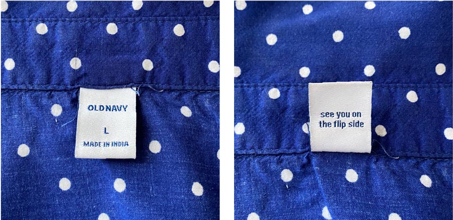
For the first time in a long while, I ironed a shirt! There, underneath the neck label,
I re-discovered a little bit of wit. It delights me every time. Thanks Old Navy!
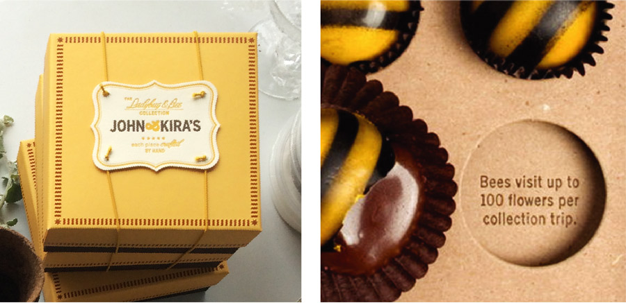
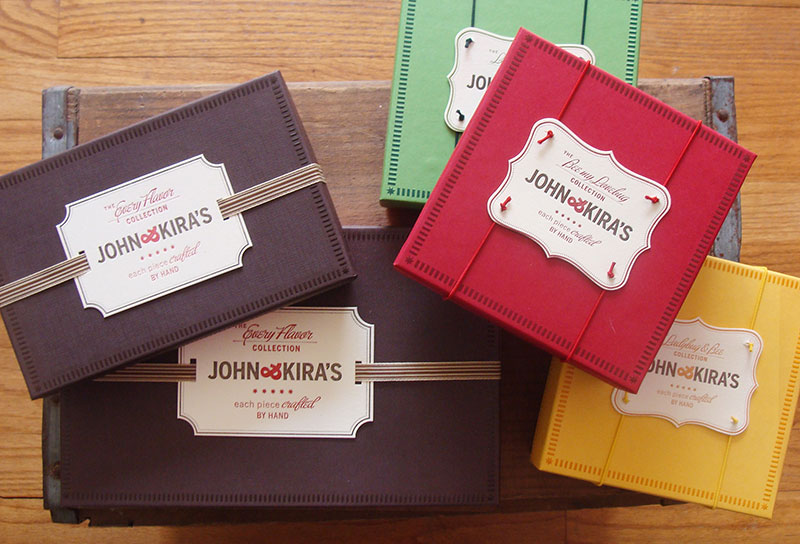
When designing the packaging system for the John & Kira’s Ladybug & Bee collection, we included trivial factoids under the chocolates of the double platform boxes. This deeper level of conversation engages the user as they eat the chocolates. It makes their experience a little bit richer, and they might learn a fun fact or two!
A good friend of mine shared her love for Honey Mama’s with our monthly Zoom call last week. She recently discovered them and professed her love for their chocolate bars, as well as the branding & packaging. The package talks to you as you unwrap it.
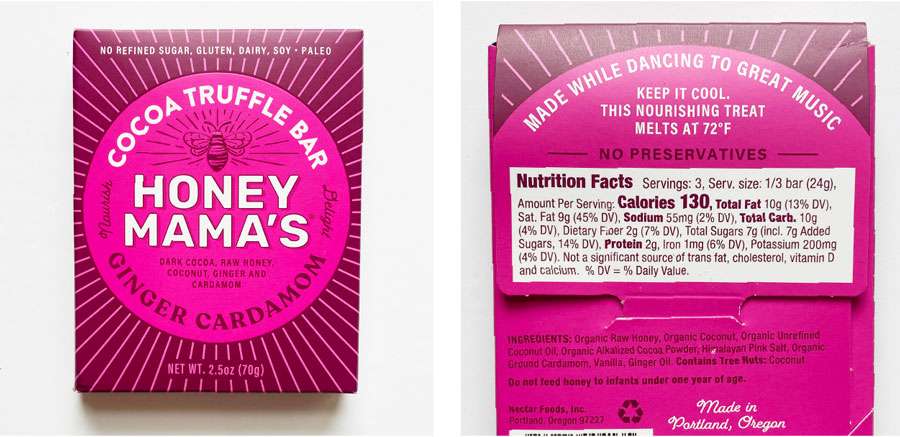
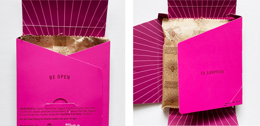
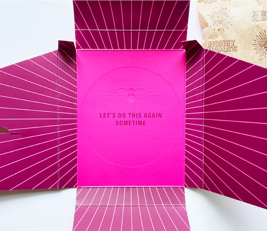 It’s thoughtful, it’s witty, and it made me like Honey Mama’s before I even tasted the product. (Which is very good, BTW!)
If you need help with ways to infuse wit into your branding & packaging or anything else, shoot me a note and we can set up a call/strategy session.
 As I dip my toes into the deep sea of blogging, I might as well take this opportunity for some shameless self-promotion. : )